Strickland: A Retro Bold Serif Font That Anchors Digital Branding
There it was—my third revision of the hero section for a boutique coaching site—and something still felt off. The headline was clear, the image compelling, but the typography lacked presence. I swapped in Strickland on a whim, set it at 48px on desktop and watched it settle into place like it belonged there all along. Not flashy. Not fussy. Just confident, grounded, and quietly elegant. That’s when I knew: Strickland isn’t just another serif font—it’s a design decision with intention.
What Makes Strickland Stand Out in Web Layouts
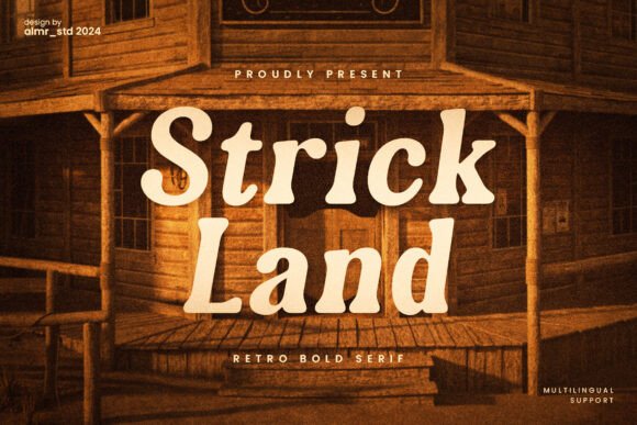
Strickland is a retro bold serif font that balances vintage charm with modern clarity. Its letterforms carry subtle slab-inspired weight, generous x-height, and clean terminals—no excessive flourishes or distracting serifs. It’s bold without being aggressive, structured without feeling rigid. In practice, this means it holds up beautifully against textured backgrounds, overlays cleanly on hero images, and scales gracefully from large headlines down to mid-size section headers (think 32–36px on mobile). Unlike some display fonts that lose legibility under compression or on lower-DPI screens, Strickland renders crisply across browsers and devices—even on iOS Safari with its sometimes finicky font smoothing.
Where Strickland Shines Online
I tested Strickland across several real-world web contexts, and its strengths became immediately clear:
- Landing page headlines: Paired with a light sans serif body font (like Inter or Manrope), Strickland creates instant hierarchy—readers grasp the core message before scrolling.
- Branded section headers: On a portfolio site, using Strickland for “Work” or “Approach” added warmth and distinction without competing with project thumbnails.
- Call-to-action buttons: At 20px on desktop (18px on mobile), it read clearly on both light and dark backgrounds—especially with modest letter-spacing (+0.5px) and sufficient padding.
- Digital brand kits: When exporting style guides for clients, Strickland gave the typography section personality while remaining professional and versatile.
- Blog post titles: Used sparingly—only for feature posts or series headers—it elevated editorial tone without overwhelming readers.
It performed especially well on a small business online store homepage, where product categories needed visual weight but not distraction. “Handcrafted Goods”, “Seasonal Collections”, and “New Arrivals” all gained quiet authority—never shouting, always inviting.
Readability & Responsiveness: What to Watch For
Strickland is designed as a display font—not a text font—and that distinction matters. It’s exceptionally strong for short, high-impact phrases: headlines, banners, logo lockups, and navigation labels with two to four words. But I wouldn’t use it for paragraph copy, form fields, or dense interface elements like dashboard tables. Its boldness can fatigue readers over longer passages, and smaller sizes (under 16px) begin to lose definition—particularly on Android Chrome or older tablet browsers.
For responsive layouts, I found success using CSS media queries to adjust size and tracking:
- Desktop (≥1024px): 48px, letter-spacing 1px
- Tablet (768–1023px): 36px, letter-spacing 0.75px
- Mobile (≤767px): 28px, letter-spacing 0.5px, line-height 1.2
On dark mode interfaces, I added a subtle text-shadow (1px 1px 2px rgba(0,0,0,0.2)) to ensure contrast without sacrificing elegance.
Smart Pairings for Balanced Digital Typography
Strickland thrives when paired thoughtfully. My go-to combination is Strickland for headings + a neutral, highly legible sans serif (like Poppins, Lato, or the system stack “-apple-system, BlinkMacSystemFont, ‘Segoe UI’, Roboto”) for everything else. This pairing supports accessibility, improves load performance (especially with system fonts), and reinforces visual rhythm. For more editorial or luxury-leaning sites, I’ve paired it with a refined serif like Cormorant Garamond (for subheads) or Playfair Display (for quotes)—but only when the brand voice calls for layered sophistication.
Avoid pairing Strickland with overly decorative scripts or condensed sans serifs—they clash tonally. And while it works beautifully alongside handwritten accents in hero graphics (e.g., a subtle script tagline beneath a Strickland headline), it shouldn’t share visual weight with them in navigation or CTAs.
Licensing, Formats & Practical Considerations
Before integrating Strickland into client work or live sites, I checked what was included: multiple weights (Regular, Bold, Black), OpenType features (standard ligatures, discretionary ligatures, stylistic alternates), and robust multilingual support—including Latin Extended-A and common diacritics. Crucially, it came with webfont files (WOFF2, WOFF) and a commercial license covering SaaS dashboards, e-commerce platforms, and digital templates—no hidden restrictions.
I loaded it via @font-face with fallbacks, preloaded the critical weight, and verified performance in Lighthouse: no layout shifts, minimal render-blocking, and fast CLS scores. For SVG-based logos or iconography, I converted Strickland to outlines—preserving its integrity across platforms and ensuring consistency even if webfont loading delayed.
One note: because Strickland is optimized for display use, don’t expect extensive caption or footnote styles. If your site requires fine typographic control for data tables or legal disclaimers, lean on your body font instead—and let Strickland do what it does best: anchor attention, express character, and make your digital presence feel intentional.