Hoterland: A Modern Vintage Sans Serif for Digital Branding
It started with a hero section that felt… polite, but forgettable. I was redesigning a boutique online store for a ceramicist—minimal, tactile, quietly confident—and the current font (a generic system sans) just floated there, neutral and unanchored. No warmth. No character. So I dropped Hoterland into the headline: “Hand-Thrown. Slow-Made.” Instantly, the tone shifted—not louder, but clearer. That’s when I knew this wasn’t just another sans serif; it was a quiet collaborator in voice-building.
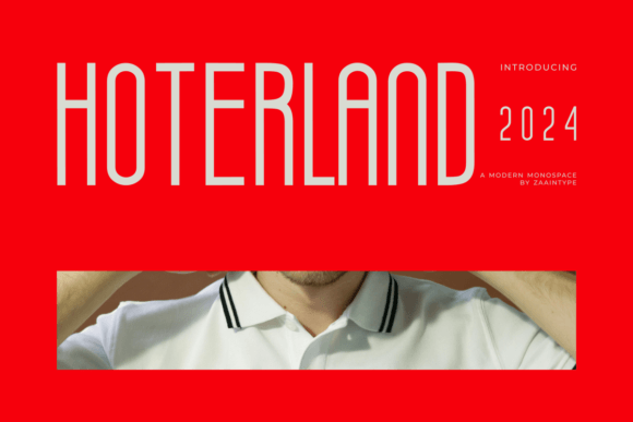
Hoterland is a monoline sans serif typeface with slender, graceful strokes and subtle vintage inflections—think mid-century signage meets contemporary UI clarity. It’s not retro pastiche; it’s refined restraint. The terminals are clean, the spacing generous, and the rhythm feels intentional, even at small sizes. As a display font, it thrives where attention matters: hero headlines, section titles, product name tags, and logo lockups. But unlike many decorative fonts, Hoterland doesn’t sacrifice legibility for charm. On mobile, it holds its shape beautifully—even at 28px on a 375px viewport—thanks to its open counters and balanced x-height.
I tested it across real layout contexts: over a soft-focus studio photo banner (light text, dark overlay), as a CTA button label (“Join the Studio Circle”), and in a minimalist product grid header. In every case, it added distinction without distraction. For the ceramicist’s site, Hoterland gave the brand a grounded elegance—neither overly crafty nor coldly corporate. It signaled care in execution, which aligned perfectly with how their pieces are made.
Where does Hoterland shine most? Definitely in hero titles, section headings, and short branded phrases. It works exceptionally well on light or dark backgrounds alike, especially with modest letter-spacing (0.5–1.0px). I avoided using it for body copy—it’s not designed for long-form reading—but paired it seamlessly with a neutral, highly legible sans serif (Inter, set at 16px/1.6) for paragraphs and captions. That contrast created instant hierarchy: Hoterland said *this is who we are*, and Inter said *here’s what you need to know*.
For a coaching website I’m prototyping, I used Hoterland for the tagline (“Clarity Starts Here”) and the main service headers (“One-on-One Sessions”, “Group Workshops”). It lent authority without stiffness—ideal for a practice rooted in empathy and precision. On a course sales page, it elevated the course title while keeping the pricing and enrollment CTA in a clean supporting font. No visual competition. Just calm emphasis.
Readability checks were reassuring. At 32px on desktop, Hoterland reads effortlessly, even with modest tracking. On mobile, I kept headlines at 28px minimum and avoided tight line-heights—1.3 worked best. Over image overlays, I applied a subtle text shadow (1px black at 20% opacity) only when needed, never heavy-handed. And crucially: I verified the webfont files included WOFF2 support and full Latin character sets before embedding. No surprises at launch.
Font pairing is where Hoterland really earns its place in a digital designer’s toolkit. Its personality is distinct enough to stand alone—but it pairs brilliantly with understated companions. Try it with a warm, humanist sans (like Poppins or Manrope) for body text, or lean into contrast with a gentle serif (Lora or Literata) for blog headers or editorial sections. Avoid pairing it with other high-contrast or script fonts—they’ll clash tonally. Hoterland isn’t loud; it’s articulate. Let it speak, then let the rest of the page listen.
I also checked what’s included: four weights (Light, Regular, Medium, Bold), true italics, OpenType features like discretionary ligatures (subtle, but lovely in logos), and multilingual support covering Western, Central, and South European languages. For client work or digital brand kits, that means fewer last-minute substitutions—and more consistency across web, social graphics, and downloadable assets. Licensing is straightforward: commercial use included, no per-page fees, and easy self-hosting for performance-conscious sites.
What surprised me most wasn’t how stylish Hoterland looked—it was how functional it felt. In a landing page scroll test with colleagues, Hoterland headlines consistently anchored attention faster than our previous font. Not because they were bigger or bolder, but because their proportions and spacing invited the eye to settle. That’s rare in a display font. It doesn’t shout “look at me”—it says “stay awhile.”
For portfolio sites, campaign landing pages, or any digital space where brand voice must land in under three seconds, Hoterland delivers nuance without noise. It’s equally at home on a SaaS dashboard sidebar heading, a newsletter banner, or a limited-edition product drop graphic. And because it’s a premium font—not a free Google Font—it subtly signals investment in craft, both visually and experientially.
One practical note: always preview Hoterland in your actual CMS or builder. Some no-code tools compress font weights or override tracking. Test it live—not just in Figma—with real content length, real spacing, real loading conditions. I caught one issue early: on a slow 3G connection, the Bold weight briefly flashed as Regular. Switching to font-display: swap fixed it. Small detail, big impact on perceived polish.
If you’re choosing a typeface to represent a thoughtful brand—whether it’s a solo creative, a small studio, or a values-driven product—you’re not just picking letters. You’re choosing a tone, a pace, a level of intention. Hoterland doesn’t try to be everything. It’s a focused, elegant, quietly confident sans serif that helps digital spaces feel human-scaled and meaningfully designed.
- Best for: Hero titles, section headers, logo text, short branded phrases, campaign banners
- Avoid for: Long paragraphs, tiny interface labels (<14px), dense data tables
- Pair with: Neutral sans serifs (Inter, Manrope) or gentle serifs (Lora, Cormorant Garamond)
- Check before launch: Webfont formats (WOFF2), language coverage, licensing scope, fallback behavior
- Mobile tip: Use 28–32px for headlines, track at 0.7–1.0px, test contrast over imagery